Design Objective:
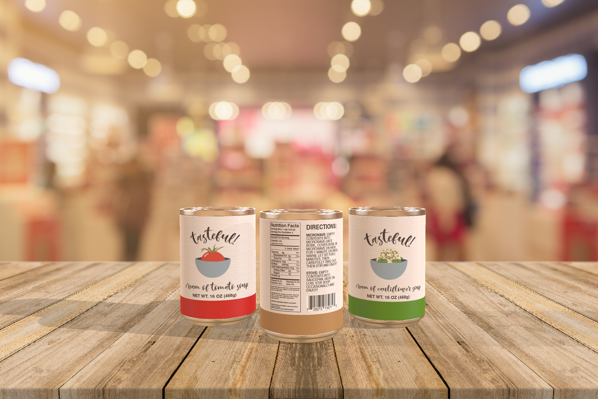
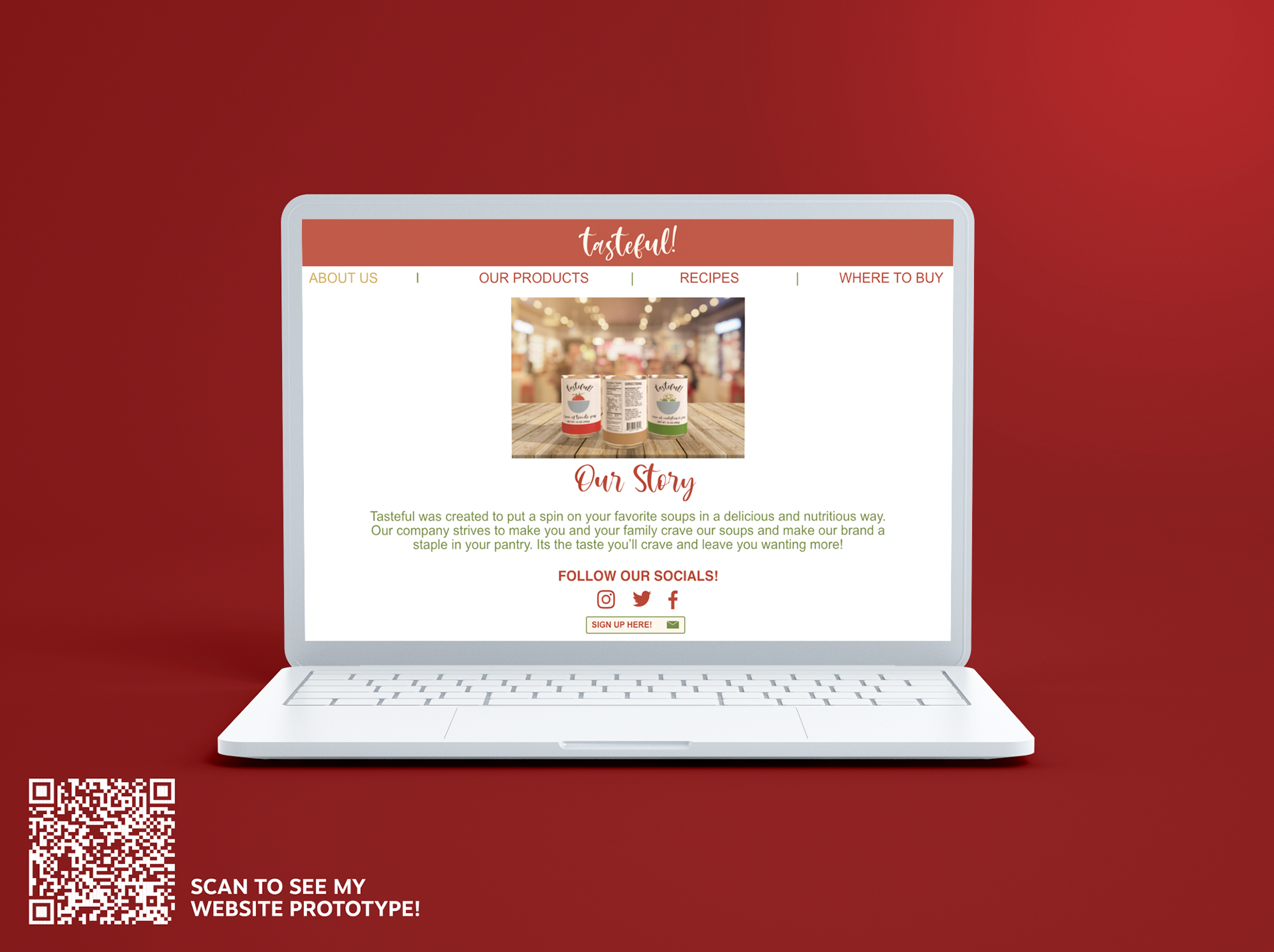
Design packaging and branding for a consumer product that will be sold in stores. Research competitors and create branding and flavors to carry throughout a series of soups. Design a style guide for the branding as well as mock-ups in Adobe Dimension of the final product.
Creative Brief:
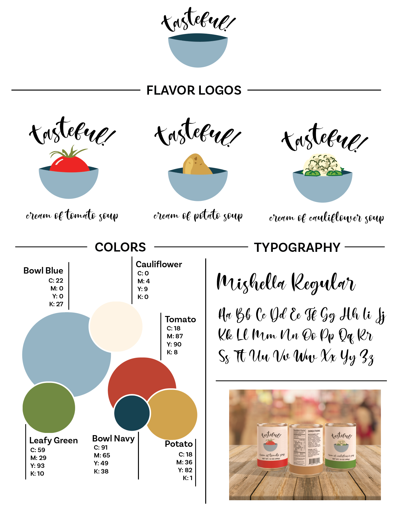
The name tasteful! to show that my brand is not only playful but is also delicious and healthy. Tasteful! is in Mishella Regular font which makes the word mark stand out from most of the other soup companies on the market. The tasteful! logo type is also curved to be around the mark rather than horizontally for even more consumer appeal. The nutrition label and directions are all in a sans-serif font so they can be legible at any distance. The logos are more illustrative to appeal to all ages. I chose the color palette of light blue, a toned-down red, muted brown, and a dull green to correlate the flavors of soup to the packaging. Red is for cream of tomato, brown for cream of potato and green for cream of cauliflower. The light blue was chosen for the bowl because it complements well with all the other colors used in the brand.


